Tuesday, December 27, 2016

How many sprites can make an animal happy?


    Of course the real question is "After how many sprites that you've drawn for all the various animal states will you start feeling depressed?"

    A large animal, like a cow or a sheep, can move in any of the four cardinal directions (up, down, left, right). It can move its tail or head. It can sit down for some time, then stand up again. This is not an enormous amount of frames to draw. But then, an animal may be pregnant. Or sick. Or both! Or a sheep can have its fur cut. Since there have to be some visual cues for those states, this means you have to modify or recolor your existing animation frames, then export them, then import them to your game assets...

    There has to be a shorter way to deal with this. It makes me wonder: In some older Harvest Moon games, a cow could be pregnant or sick, but not both. Was it some gameplay design decision, or was it in order to avoid drawing another set of graphics where cows were both pregnant and sick? Anyway, let's summon our trusted friend, Sheepio, and see if we can "derive" some extra graphics from our basic ones.

Hey man. How you doin'.

    So we have Sheepio's basic animations: Standing, walking, moving, sitting, moving its head etc. in all four directions. In these animations Sheepio has its fur all grown. What we are going to do is grit our teeth and make another set of animations, modifying our original set, where Sheepio is pregnant. Since this will be our only other anination set, apart from the bigger belly, we can make its snout redder, as a more visible cue that this particular animal is pregnant.

    The question now is, can we manipulate those two sets to introduce sheepio being sick or having its fur cut, either when pregnant or not? Once again, shaders come to our aid.

Friday, December 16, 2016

Chickens and cows: A tale of collisions and betrayal

 
We'll get to you in a minute, dear cows and baby cows. hang in there!

    One of the first steps of adding livestock to your farm game is to determine how they interact with the Player Character (PC) and among themselves. The difficulty with this aspect of design is the future problems and/or conflicts that will appear because of the path you took. Problems which you didn' t see coming, and for which you come up with a solution that eventually spawns even more problems. To wit:

    1) Let's design chickens in the following way: They are not considered as obstacles, so PCs can pass right through them. Additionally, one can pick them up, carry them around and drop them anywhere! Neat! Only...

    A) How will I display the character holding the chicken up like an item? Oh yes! Items! I will create a dummy item that looks exactly like a chicken! In reality, when players pick up the chicken, it vanishes, and a "chicken item" is created that players immediately get to hold in their hands. Phew! That wasn't so hard!

It's so dense, every single image has so many things going on.

    B) Shit. I pressed the "back" button while holding Chica, and she went straight into my backpack! This isn't right! I can't be running around carrying chickens in my pockets! Why is this happening?!??!?

Monday, November 21, 2016

Imma charging mah potato!

    Last week I coded the infrastructure for field crops. My first victim was the fabled potato.

Is it me, or does the little fella look like he's just
escaped from the asylum?
    Crops can be either one-time, or they can provide additional yields every X days. There will be a large variety of crops, and some crops will be available once players meet certain criteria, like having shipped specific amounts of other crops or having befriended certain individuals. Crops are also prone to destruction by weather effects and other perils.

    Also, remember about talking about the potential to be able to move while charging a tool? It's already done! Now combat should be much more fluid. But that's not all: Special "run-and-hit" animations, as well as an ultra-powerful strike have been added! Oh, and a rolling animation too! I guess at this point I should rename the game to Dark Crops or Crop Souls or whatever. Stay tuned for an upcoming demonstration of combat!

Saturday, November 12, 2016

Sprite multi-recoloring shaders and Game Maker: Studio implementation

Today we will get a little bit technical. Using a simple set of fragment shaders and color maps, we will entirely recolor a sprite on the fly.

Although the idea is implemented in Game Maker Studio, its principles should be applicable in any other shader-enabled application. Note that in Game Maker: Studio you may need to turn off "Interpolate colors between pixels" in the Global Game Settings for this to work!

This tutorial is aimed mainly at people with a basic or intermediate (like me) understanding of shaders. The method presented is not intended to be the fastest or more compact and efficient, and is broken down in steps that would be avoided by more experienced programmers, but I chose this structure in order to a) Make the method easier to understand and b) Highlight some specific things like texture coordinates, shader values and parameters[*]If there is one thing I hate in tutorials, it's this: "How to draw a kickass elf warrior: Step 1. Draw three circles. Step 2. Draw the rest of the kickass elf warrior.".

First of all we need a character sprite. It can contain many sub-images but it's not mandatory. Here is our guy:


Since the sprite will be recolored, we don't necessarily have to use good-looking colors: In fact, it helps if we use distinguishable hues to separate visually the various body parts and/or potential body accessories. For the same body part, we can use different brightness values to visualize that variance in the final sprite. But really, one can just paint a sprite with "normal" skin colors and everything: As long as all possible different colors are set up correctly, we are ok.

This is our "base sprite": It serves as the precursor to our "color mapped" sprite. But how exactly does this method work?

At first, we set up a "color mapping" shader and, using this shader, we draw all of our sprite's subimages on an empty surface. The only "additional" info for this first shader is a color map. The color map is simply a one-pixel-height sprite containing every color value in the base sprite that we created, in no particular order (but some hue grouping helps). If you want a value of the base sprite to be unchanged, like the sprite's outline, you can omit this color from the color map.


For our example, I am using a 32x1 sprite as the color map. Remember, if you are using Game Maker Studio, check the "use for 3d" box in the sprite properties of the color map! This will create a separate texture page for it and thus getting the texture coordinates of every pixel in the shader will be much easier[*]Other sprite dimensions will work, but for the "use for 3d" option to be available, they must be integer powers of two, like 1, 2, 4, 8, 16, 32, 64 etc.. Also, not all pixels of the color map have to be used: If you have a 20 different colors sprite, you can use a 32x1 color map where the first 20 pixels will be the various sprite colors and the rest can be a color not used anywhere in the base sprite.

Friday, November 4, 2016

Coffee and planned features

    It's Friday, I'm sitting at my desk with a hot cup of chestnut-flavoured coffee, and figured I should be talking a bit about the game so far: Development, features and goals. Plus my CEO[*]Due to a shortage on suitable (read: affordable) candidates, I appointed my cat as CEO. She has the attitude, after all. insisted I should be more vocal about what's going on.


    Regarding the game's duration, there will be no time limit. You will be able to run your farm forever. However there is a "main plot". For now, plans are that it should be resolved during the second year. You can choose to ignore the main plot and just play happy farmer. Or you may engage it and go deeper, thus discovering the true world of Gleaner Heights. There are also sub-plots involving the local townsfolk. In contrast to your average farming sim, you have the ability to change their lives forever, and I am not talking about a different line of dialogue here and there. But then again, I can't give more info, can I?

Monday, October 31, 2016

Wednesday, September 14, 2016

Just a screenie

Today we visit the house of a cranky old man. A hoarder and a drunkard, but a source of great knowledge about the village's past...if you become friends.

Clicky clicky for larger screenie!
Development goes really smooth, more and more assets are ready. Hopefully by the end of October I'll have a nice teaser and by the end of the year a proper Steam Greenlight entry!

Sunday, August 7, 2016

Provisional Blog title and progress report

Hi everyone!

Originally I planned to name the game Harvest Peaks, so this was the blog's title. However I sense that I might be treading into murky waters, since I would be partially using words from trademarked titles of certain franchises. For example the "Harvest" part is a nod to Harvest Moon. Is it "safe" to do so? I don't know yet.

Zenimax had a scruff with Mojang because the former has trademarked the Elder Scrolls title and the latter made a game and named it Scrolls. It didn't even have to do anything with the Elder Scrolls series. It just contained a word!

"But, vdweller, you aren't Mojang! You're just a small developer! Surely they won't bother you!"

Hmmm... another small-time developer was torn a new one by InXile (you know, those true indie, game loving, nothing to do with greedy corporations, funded by the people guys). The reason? Said dev named a game "Alien Wasteland". Inxile owns the Wasteland trademark. Facepalm. The Aftermath? Title had to be changed to Action Alien

Maybe Inxile had no choice. Maybe the main guys had no problem but their legal team told them "blah blah sir we must do it because of reason X". The point is it was done. This is how things work I guess.

So until (and if) things are cleared up, I will use a temporary blog (and project) title. It's a farming game with mysteries invovled. So, Mystery Farming it is, for now! Even if I come up with the final name, I see no harm in having the address remain mysteryfarming.blogspot.com . The same applies to the Twitter username.

As for the progress so far: More graphics are ready. Below is a view of a place just outside your farm inside the Game Maker: Studio editor. The villa graphic is not yet finished. The abandoned villa is going to play a major role in the game. A mysterious man lived there many years ago, then something terrible happened...


Tools are also ready to use! Each tool has different power levels, unlocked via upgrading them.


I'm currently working on the inventory screen. I like the style of the older Harvest Moon games. I don't want the inventory to be extremely streamlined, with lots of hotkeys. I am thinking of  a separate "Tools" and "Items" group of slots. You can assign 4 tools and 4 items to their respective quick slots and then you can then cycle through them without having to access the inventory screen again. Also, I'm thinking about the ability to filter the "Items" group and display only food, equipment, miscellaneous items etc.

That's all for now! See you next update!

Wednesday, June 29, 2016

Are you still there?

More than ever!


Currently working on exterior graphics. This is the path leading to the waterfalls and the great hotel. Day/night cycle is also ready!

Not much else to say, but rest assured I'm on the job!

PS The cliff face needs more blue in shadows.

Sunday, June 12, 2016

A study in pixels: Rocks and grass

Carefully concealed disclaimer

This is a series of steps in order to create a rocky wall and some grass on top. Aside from the transition from rock (vertical plane) to grass (horizontal plane), I won't be covering edges, ground shadows etc.

I am no pixel art professional. I just like recording and sharing my venture into the world of pixel art. And, who knows, until that uber-professional artist approaches you (or me) and teaches you (or me) all their secrets and techniques, something posted here could be of use to somebody. Images are scaled to 300% for your viewing convenience. As a final note, colors may require tweaking depending on the color context of the rest of the image. Don't copy colors from tutorials unless you make sure they fit your scene. Rest assured that I'll be tweaking those "final" images a lot as I go along making more graphics.

Wednesday, June 8, 2016

The graphics of Harvest Peaks: Town Diner

It's easy to speak of a game without having much in your hands to show. So, let's take a look at one of the town's locations, the Diner.

Click on the image to view a crisp, 3x version.
I am a newcomer to pixel art so it should come as no surprise if many outlines are improper or object proportions are slightly off -at least for what's common for this kind of graphics: some objects usually tend to be exaggerated in such games but I can't bring myself to follow this tradition.

Ignore the little guy behind the counter -it's just for helping measure the size/height of other objects.

So how does it look? Can you tell what's on the table next to the door? Should I add more objects, Should I make some objects bigger and thus more identifiable? What about the colors? Let me know!

Wednesday, June 1, 2016

Curved, rising paths in orthographic projection

Before delving into the murky waters of our problem, let's first talk a bit about screen projections of the game world:

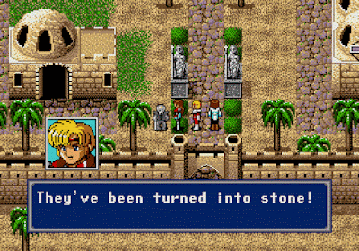
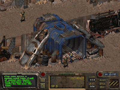
Two famous ways to display the game world are isometric and orthographic projection. Without employing any technical jargon, let's just say that both projections have no vanishing points (all imaginary lines that define structures like buildings are parallel), isometric (iso) projection displays the top of a structure and two sides and orthograhic (ortho) projection only displays the top and one side.

Phantasy Star IV (1993 - Sega Genesis) uses orthographic projection

Fallout (1997 - PC) uses isometric projection
There is a wealth of technical info around the net for achieving both projections in a consistent manner.

Harvest Peaks will use ortho projection. It's simple and easy for the player to navigate, especially in a farming sim game where you walk tile by tile to pick up fruit and other things. Games like Harvest moon (SNES) used it and it was fine, while for example Playstation's Harvest Moon: Back to Nature used iso projection, which I found really hard to get used to. There is something inherently baffling when you press down and you see your character move down-left in a diagonal fashion.

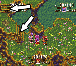
One of the weak points of ortho projection is that most "height changes" (for example when players walk a stairway to a higher level in their current map) are either horizontal or vertical. There is a general lack of curved paths, especially when height changes.

Note the arrows: Stairs change height first horizontally then vertically.
So what if we want to design both a curved path with simultaneous change in altitude? Is it worth attempting? Let's find out!

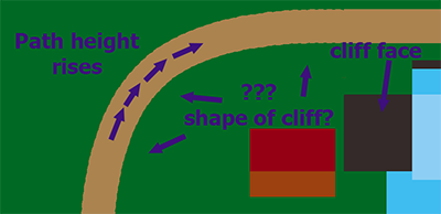
In the "placement map" of Harvest peaks, where I simply place rudimentary, undetailed tiles just for the very basic layout of the town, just to see where the town square, your farm, the mountain hotel and every other building will be, I wanted to do the following:

This path leads to the mountain which is, of course, higher than the rest of the town.
So players walk this curved path which also rises in elevation until it reaches a flat state. But what happens with the "cliff face" of  such a path in ortho projection? How will the tileset's textures be drawn in order to convey this change in altitude?

Sunday, May 29, 2016

So what do you get...


...if you cross a farming sim in a seemingly quiet town full of secrets, plots, double lives and supernatural horrors?

...A mess?

...A masterpiece?

...A lawsuit?

So many possible outcomes! But let's go for the masterpiece.

Since Emerge: Cities of the Apocalypse came out, I have been messing with this idea in my head.

You have played farming sims (hopefully). You have experienced the innocence. The quiet village life. The friendly townsfolk. The cordial invites to festivals. Wake up. Plant stuff. Water plants. Now run to town! Give presents to your prospective wife. Go fishing. Go home. Sleep. Repeat. Innocence.

How about plotting with a married woman to get rid of her abusive husband and take his place? Or finding out about an abandoned villa that no one dares to enter or even speak of? Or about meeting a mysterious illusionist performing in the town's most esteemed travel lodgings, atop the mountain overlooking the waterfalls?

What can you expect from this blog? Well, I'll be using it as a dev log for the creation of my next game, which will be an amalgam of the concepts shown above. I will be posting interesting ideas, as well as game art, in a tutorial-ish fashion. Feedback and suggestions are welcome!

At this point I should clarify that the game is now beginning development. Right now I am fiddling with pixel art, trying to find a coherent, aesthetically pleasing style. The game will be programmed in Game Maker: Studio.

So let's begin the journey! See you along the way!