Before delving into the murky waters of our problem, let's first talk a bit about screen projections of the game world:
Two famous ways to display the game world are isometric and orthographic projection. Without employing any technical jargon, let's just say that both projections have no vanishing points (all imaginary lines that define structures like buildings are parallel), isometric (iso) projection displays the top of a structure and two sides and orthograhic (ortho) projection only displays the top and one side.
 |
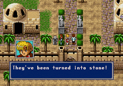
| Phantasy Star IV (1993 - Sega Genesis) uses orthographic projection |
 |
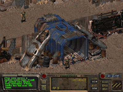
| Fallout (1997 - PC) uses isometric projection |
There is a wealth of technical info around the net for achieving both projections in a consistent manner.
Harvest Peaks will use ortho projection. It's simple and easy for the player to navigate, especially in a farming sim game where you walk tile by tile to pick up fruit and other things. Games like Harvest moon (SNES) used it and it was fine, while for example Playstation's Harvest Moon: Back to Nature used iso projection, which I found really hard to get used to. There is something inherently baffling when you press down and you see your character move down-left in a diagonal fashion.
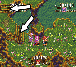
One of the weak points of ortho projection is that most "height changes" (for example when players walk a stairway to a higher level in their current map) are either horizontal or vertical. There is a general lack of curved paths, especially when height changes.
 |
| Note the arrows: Stairs change height first horizontally then vertically. |
So what if we want to design both a curved path with simultaneous change in altitude? Is it worth attempting? Let's find out!
In the "placement map" of Harvest peaks, where I simply place rudimentary, undetailed tiles just for the very basic layout of the town, just to see where the town square, your farm, the mountain hotel and every other building will be, I wanted to do the following:
 |
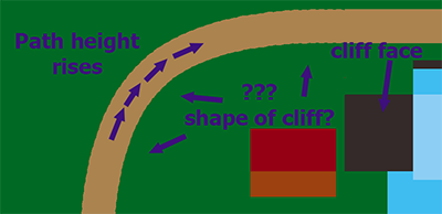
| This path leads to the mountain which is, of course, higher than the rest of the town. |
So players walk this curved path which also rises in elevation until it reaches a flat state. But what happens with the "cliff face" of such a path in ortho projection? How will the tileset's textures be drawn in order to convey this change in altitude?


